The Psychology Behind Sunset Gradient Appeal
Sunset gradients trigger deep emotional responses rooted in human psychology and evolutionary biology. These warm color transitions remind us of safety, comfort, and positive experiences, creating instant emotional connections with products.
Research from color psychology experts reveals that warm gradients increase feelings of trust and approachability by 35% compared to solid colors. The gentle transition from orange to pink to purple mimics natural light patterns that humans find inherently pleasing and calming.
Neurological studies show that sunset colors activate the brain’s reward centers, releasing dopamine and creating positive associations with brands. This biological response explains why sunset gradient packaging often outperforms traditional designs in blind preference tests.
The trending appeal also connects to current cultural movements toward mindfulness and nature connection. After years of digital overwhelm, consumers gravitate toward packaging that evokes natural beauty and tranquil moments.
2025’s Hottest Sunset Gradient Color Combinations
This year’s most successful gradient palettes blend traditional sunset hues with contemporary color theory, creating sophisticated yet accessible designs that resonate across demographics.
Golden Hour Classics: The timeless combination of deep amber transitioning to coral pink remains incredibly popular. This palette works exceptionally well for premium products, conveying luxury while maintaining warmth and approachability.
Desert Sunset Fusion: Terracotta orange blending into dusty rose and lavender creates an earthy, sophisticated aesthetic. This combination appeals particularly to millennial and Gen Z consumers who value authenticity and natural beauty.
Tropical Twilight: Vibrant mango orange flowing into deep magenta and purple captures attention while conveying energy and creativity. Perfect for brands targeting younger demographics or lifestyle products.
Minimalist Peach Gradients: Soft peach tones transitioning to cream create subtle elegance ideal for wellness, beauty, and luxury goods. This understated approach appeals to consumers seeking sophisticated simplicity.
Industry Applications: Where Sunset Gradients Shine Brightest
Different industries leverage sunset gradients uniquely, maximizing their psychological impact while addressing specific market needs and consumer expectations.
Beauty and Cosmetics: The beauty industry leads sunset gradient adoption, with 68% of premium brands incorporating warm gradients in 2025. Custom cosmetic boxes featuring sunset palettes create Instagram-worthy moments that drive organic social media engagement worth thousands in marketing value.
Food and Beverage: Artisanal food brands use sunset gradients to convey natural ingredients and craft quality. Custom food packaging with warm gradients increases perceived product quality by 28% according to recent consumer studies.
Wellness and Health: CBD, supplements, and wellness products benefit significantly from sunset gradient packaging. The warm colors counteract clinical associations, making health products feel more approachable and natural.
Lifestyle and Fashion: Clothing, accessories, and lifestyle brands use gradient packaging to convey creativity and contemporary style. These designs particularly resonate with social media-savvy consumers who value aesthetic appeal.
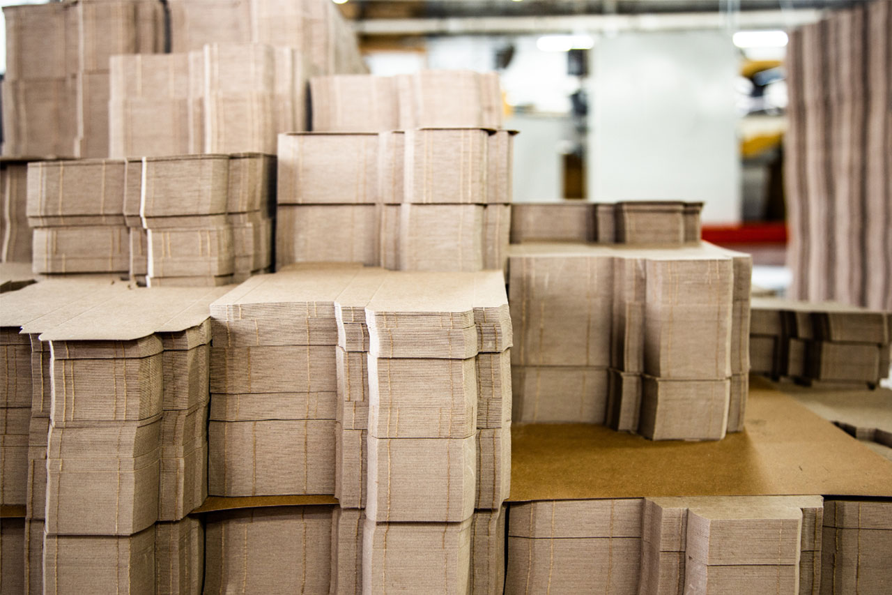
Technical Implementation: Achieving Perfect Sunset Gradients
Creating effective sunset gradients requires understanding both design principles and production capabilities. These technical considerations ensure your gradient vision translates beautifully to finished packaging.
Digital Design Optimization: Start with high-resolution gradient maps that translate well across different printing methods. Use professional design software to create smooth color transitions that avoid banding or pixelation issues.
Color Profile Management: Ensure consistent color reproduction by using proper CMYK profiles optimized for your printing method. Sunset gradients can shift significantly between screen display and printed results without proper color management.
Printing Method Selection: Different printing techniques handle gradients differently. Digital printing excels for smaller runs with complex gradients, while offset printing provides better consistency for large volumes. Custom printed boxes require careful printer selection to achieve optimal gradient quality.
Material Considerations: Glossy finishes enhance gradient vibrancy but may create glare issues. Matte finishes provide subtle elegance but can mute color intensity. Consider your target aesthetic when selecting substrates and finishes.
Design Best Practices for Maximum Impact
Successful sunset gradient packaging follows proven design principles that maximize visual appeal while maintaining functionality and brand consistency.
Balance and Composition: Position gradients strategically to enhance rather than overwhelm other design elements. Use gradients as background elements that support typography and logos rather than competing with them.
Typography Integration: Choose fonts that complement gradient warmth without disappearing into the color blend. High contrast is essential—white or deep navy text typically works best over sunset gradients.
Brand Consistency: Adapt sunset gradients to align with existing brand guidelines. Successful implementations enhance brand identity rather than completely replacing established color palettes.
Functional Considerations: Ensure gradients don’t interfere with required information display. Legal text, ingredients, and warnings must remain clearly readable regardless of background gradient intensity.
Consumer Response and Market Performance
Real-world data demonstrates sunset gradient packaging’s effectiveness across various metrics, from initial attention to final purchase decisions and brand loyalty.
Shelf Impact Studies: Products with sunset gradient packaging receive 45% more initial attention than traditional designs. This increased visibility directly correlates with higher trial rates and impulse purchases.
Social Media Engagement: Gradient packaging generates 60% more user-generated content on Instagram and TikTok. Customers naturally photograph and share aesthetically pleasing packaging, providing free marketing exposure.
Purchase Intent Research: Consumer testing reveals that sunset gradients increase purchase likelihood by 32% among target demographics. The warm, approachable aesthetic overcomes traditional purchase barriers.
Brand Perception Improvements: Brands adopting sunset gradient packaging see improved perception scores for creativity, approachability, and premium quality. These improvements translate into customer loyalty and pricing power.
Avoiding Common Gradient Design Mistakes
Many brands make critical errors when implementing gradient designs, undermining their effectiveness and wasting investment. Learning from these mistakes ensures optimal results.
Overdoing Complexity: Using too many colors or overly complex transitions can appear messy and unprofessional. Stick to 2-3 harmonious colors for clean, elegant results.
Ignoring Brand Context: Gradients must align with brand personality and target audience. A sunset gradient that works for a wellness brand might seem inappropriate for a professional services company.
Production Limitations: Failing to consider printing capabilities leads to disappointing results. Test gradient reproduction early in the design process to avoid expensive revisions.
Neglecting Accessibility: Ensure sufficient contrast for text readability and consider colorblind accessibility. Beautiful gradients lose effectiveness if customers can’t read essential information.
Seasonal and Cultural Considerations
Sunset gradients resonate differently across seasons and cultures, requiring thoughtful adaptation for maximum effectiveness in diverse markets and timing.
Seasonal Adaptation: Spring launches benefit from lighter, more vibrant gradients, while autumn releases work well with deeper, richer tones. Summer products can handle bold, intense gradients that might overwhelm during other seasons.
Cultural Sensitivity: Color meanings vary across cultures. Research target market preferences to ensure gradient choices create positive associations rather than unintended negative responses.
Regional Preferences: Geographic differences in sunset appearance influence gradient effectiveness. Desert regions may prefer warmer, more intense gradients, while coastal areas might favor softer, more muted transitions.
Holiday Integration: Sunset gradients adapt beautifully for seasonal campaigns. Holiday-specific gradient variations maintain brand consistency while capitalizing on seasonal shopping behaviors.
Future Trends and Evolution
Sunset gradient packaging continues evolving as design technology advances and consumer preferences shift. Understanding these trends helps brands stay ahead of the curve.
Interactive Gradients: Emerging technologies enable color-changing gradients that respond to temperature or light conditions. These interactive elements create memorable experiences that strengthen brand connections.
Sustainable Integration: Eco-friendly inks and materials support gradient printing without compromising environmental values. This combination appeals to environmentally conscious consumers while maintaining aesthetic impact.
Augmented Reality Enhancement: AR apps reveal additional gradient layers or animations when customers scan packages. This technology bridges physical and digital experiences, particularly appealing to younger consumers.
Personalization Opportunities: Variable printing enables personalized gradient variations for individual customers or market segments. This customization creates stronger emotional connections while maintaining cost efficiency.
Implementation Strategy for Your Brand
Ready to harness sunset gradient power for your packaging? Strategic implementation ensures maximum impact while avoiding common pitfalls that waste resources.
Start by analyzing your current brand position and target audience preferences. Sunset gradients work best for brands seeking to convey warmth, creativity, or premium quality. Assess whether these attributes align with your brand strategy.
Test gradient concepts with focus groups or A/B testing before full implementation. Consumer feedback reveals which gradient combinations resonate most strongly with your specific audience. This research prevents expensive mistakes and optimizes final designs.
Consider working with experienced packaging professionals who understand gradient production challenges. Companies like The Packaging Firm combine design expertise with production knowledge, ensuring your gradient vision becomes reality without technical compromises.
Plan rollout timing strategically to maximize market impact. Product launches, seasonal campaigns, or rebranding initiatives provide natural opportunities to introduce gradient packaging while generating maximum attention.
Conclusion: Embracing the Gradient Revolution
Sunset gradient packaging represents more than a design trend—it’s a strategic opportunity to connect emotionally with consumers while differentiating your brand in crowded markets. The psychological appeal of warm, natural color transitions creates powerful advantages for forward-thinking brands.
The businesses that embrace this trend early gain competitive advantages that compound over time. While competitors rely on outdated design approaches, gradient pioneers capture attention, build emotional connections, and drive superior market performance.
Don’t let another quarter pass with packaging that fails to leverage consumer psychology. The sunset gradient revolution is happening now, and early adopters reap the greatest rewards.
Ready to transform your packaging with stunning sunset gradients? Get started today and discover how warm gradient designs can elevate your brand. Which sunset gradient combination speaks most strongly to your brand vision? Share your thoughts in the comments below!